FrameFlow's Dashboards section is home to two different data point panels: the Data Point List panel and the Data Point Value panel. The data point value panel shows the current value for a selected data point. The data point list panel shows data point values for multiple network devices associated with an event monitor. To learn how to implement each of these panels in your dashboard configuration, read on.
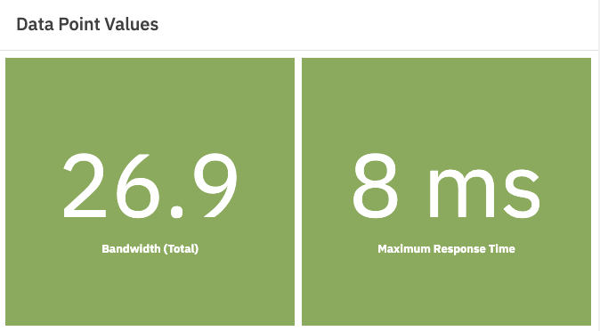
The Data Point Value panel is used to showcase one or a few important values for at-a-glance interpretation. Use it to single out a metric like bandwidth or ping response time and keep an especially watchful eye over it. By default, its color will indicate the status that corresponds with the value shown. For example, a yellow panel means warning, a blue panel means info, and a red panel indicates a critical alert level.
Right-click on your dashboard and select "add panel". From the list of panels, select "data point value".
 Data Point Value Panel
You can customize the font, font size, prefix, or postfix that go with the metric you're watching, allowing you to create a more cohesive dashboard. Add a descriptive title and/or icon and your Data Point Value panel is ready for viewing.
Because it is meant to single out one or more metrics and display them boldly 24/7, it's not recommended to add too many data points to this panel. The Data Point Value panel does its job best when just a few key metrics are displayed on it.
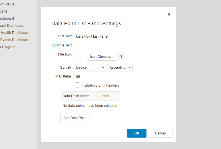
To create a Data Point List panel, right-click on the dashboard to add a new panel and select "data point list" from the menu that appears. Choose an event monitor that the panel will select data from. Once you've done this, choose the data point you want to display. The panel will show that data point value for each network device associated with the event monitor you choose. Repeat this process for each data point you want to display.
 Process of Choosing Data Points
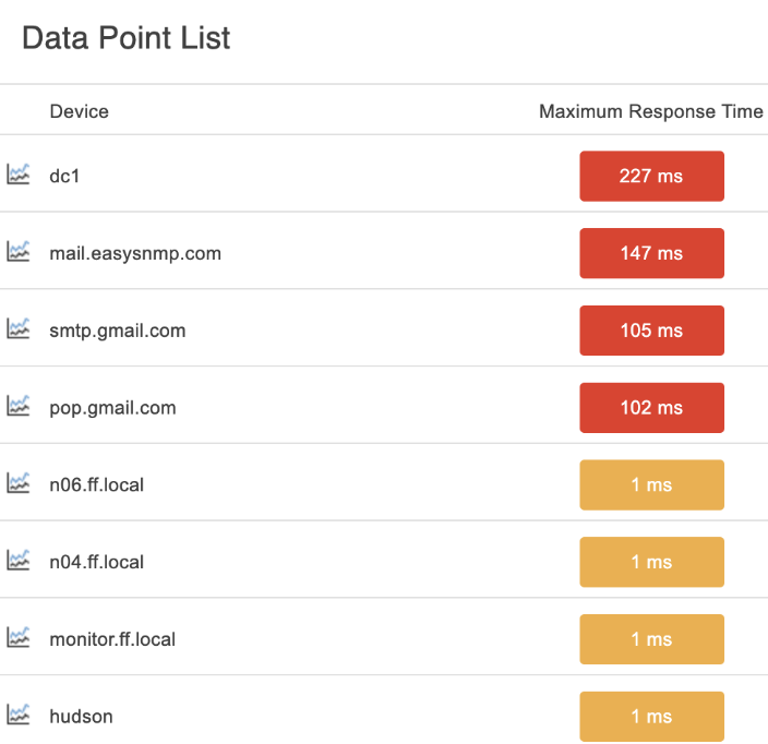
You can choose what to title your panel and optionally add an icon. By default, the background color of the value indicates status. You can change this by choosing "solid" instead of "by status". When set to "solid", the panel text will be displayed in the color that you select. When set to "green/orange/red" the text will be displayed in green, orange, or red depending on the data point value and the thresholds you specify. "Default/orange/red" is the same, except the text is shown in the theme's default text color instead of green.
 Default/Orange/Red Setting
There are multiple sorting options here as well. Under "sort by", choose the order by which data point values will appear in the panel. Choose either "ascending" or "descending" to further customize the way the data points will be ordered.
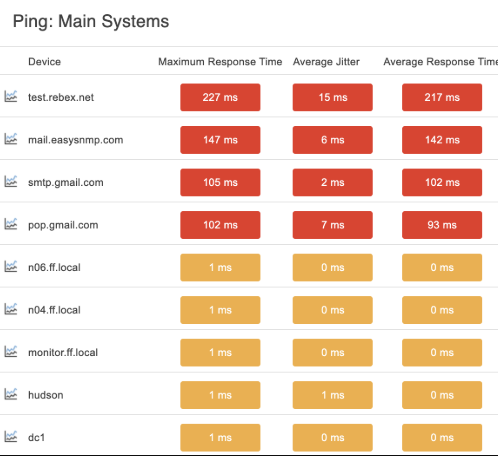
For a dynamic and informative Data Point List panel, consider adding more than one column. Use the "add data point" button and select another data point you'd like to keep a close eye on. Repeat the above steps to configure this column as well. This panel can be used to display multiple related metrics for a well-rounded view of operations. Make sure to check "include column headers" so each column of values is clearly labeled.
 Ping Dashboard Panel with 3 Columns
In this tutorial, we taught you about the data point list and Data Point Values dashboard panels. Now, you can create beautiful and informative dashboards that contain information on your data points at a glance. Make sure to visit our features page again soon to view more new tutorials that exemplify the different types of dashboard panels we offer!
More IT Monitoring Features