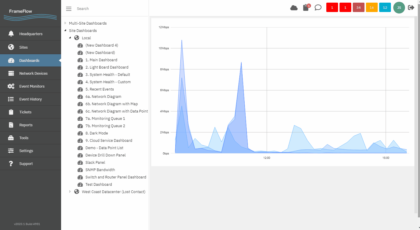
In addition to our ready-made dashboard panels, FrameFlow also offers a robust graph-making feature. Use the Graph panel to contextualize data from your other dashboard panels, or use them on their own to convey information. Each graph you create has a Graph Explorer that lets you see its data in more detail if needed.
There are three different ways to choose the data that will appear in your graph: "Device, Monitor, and Data Point", "Monitor and Data Point" and "Device and Monitor". Below, we explain how to use each one.
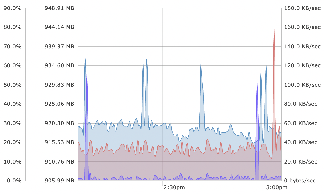
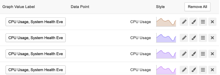
"Choose device, monitor, and data point" lets you select a data point from an event monitor for a specific network device associated with the event monitor. For example, maybe you want to graph CPU usage from the System Health Event Monitor for one of your key machines.
Click "Add Graph Value" to open the chooser menus and use each menu to select a device, monitor, and data point respectively. Once you've entered one device/monitor/data point combination, you can add more combinations to be displayed on the same axis. This helps you compare and contrast different values visually. The second combination will be shown in a different color than the first one for easy viewing. The graph data will be layered in the order in which you added each combination, but you can grab them using the hamburger icon to bring them to the top or bottom.
 Multiple Metric Graph
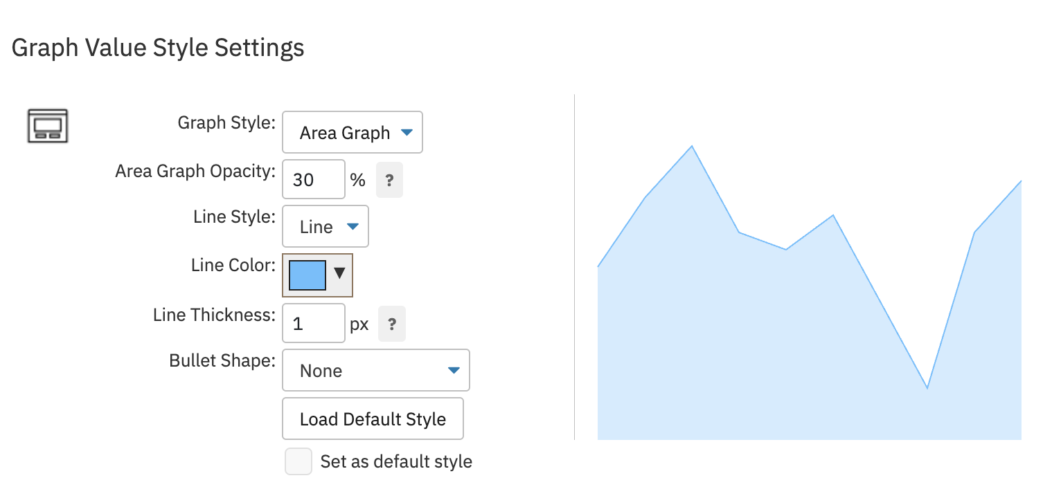
Clicking the chevron next to each graph data point reveals some style settings with which you can customize the way your graph is presented on your dashboard. Under "Style", you can choose whether your graph will be displayed as an area graph or a line graph. Changing the opacity of your graph data allows a layered graph setup to be more legible. Graphs are most easily read when the most opaque element is in the back.
 Paintbrush Settings
Under "Line Style", you can choose between line and step. You can also choose the color and thickness of the line. Decide whether or not you want bullets on your graph, then customize the way the bullets look. If you want every graph you make to have the same styles, you can check the box titled "Set as Default Style" to save your changes and implement them in other future graphs.
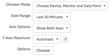
Back in the main settings, decide how you want the axes of your graph to look.
 Graph Style Options
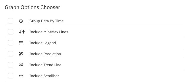
Clicking the "Options" chooser button will open a menu of features that you can optionally add to your graphs. Grouping data is helpful if you want to compare values between different sections of time. Choose whether or not to include minimum/maximum lines on your graph. Include the legend if you want to add additional context to your graph. FrameFlow also has an option to predict future graph values based on present data, so add predictions if you want to take advantage of this feature. Trend lines help contextualize patterns within your graph data. Include the scrollbar if you want additional help navigating across the graph.
 Graph Accessory Options
To quickly select the data for more than one device, use the option "Choose Monitor and Data Point". Add graph values using the chooser as above, then adjust the order and default labels for the graph data if needed. The graphs are automatically generated and each one corresponds to a different network device that's under the chosen event monitor. Repeat the steps above to configure the rest of your graph's settings.
 Automatically Populated Graphs
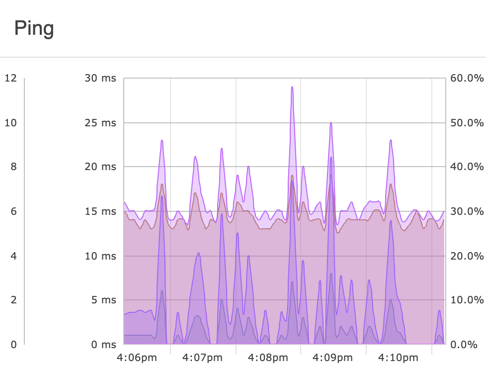
"Choose Device and Monitor" graphs multiple data points from a device/event monitor combination. The upper limit on data points is sixteen per graph, so you may need to create another graph panel to display all the relevant data points. In most cases, just one will suffice. This style of graph works best with data that's all of the same type, like multiple metrics that are measured in milliseconds. Repeat the steps mentioned in the "Device, Monitor, and Data Point" section to configure the rest of your graph.
 Device and Monitor Graph Example
Once you've configured the settings for your graph panel and right-clicked on your dashboard to finish editing it, you'll notice a [...] menu when you mouse over your graph panel. Clicking this opens the Graph Explorer, a powerful tool that lets you pan, zoom, and scroll across your graph like never before. To learn how to use it to its full potential, read this article.
 FrameFlow's Graph Explorer
In this tutorial, we showed you how to create and display beautiful graphs. Make sure to check out our other dashboard tutorials in the Features section of our website to learn more about the functionality of FrameFlow Dashboards.
More IT Monitoring Features