Network diagrams are informational displays that are entirely customizable. They're used to create a visual sense of IT operations on-premises, in the cloud, or even internationally. You can choose what information to highlight, what devices to display, and much more. This tutorial seeks to highlight each feature available so you can create the network diagram that's best suited for your monitoring purposes.
When creating a new Network Diagram panel, you're first presented with the option of defining a title, subtitle, and icon to be associated with the diagram. Once you're done with that, you'll notice that the panel begins as an otherwise blank slate.
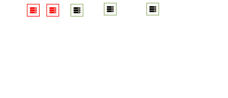
 Adding a Network Diagram
In most cases, the first item you'll want to add is a network device. It'll appear with an icon that's color-coded based on its alert status. You may notice that moving the icon around is difficult without disturbing the position of the entire panel. If you're not noticing it now, it'll most likely still become a problem the busier your panel becomes. Avoid this now by clicking the "Actions" dropdown menu and selecting "Lock Panel Positions". This will lock the current position of the entire panel until you unlock it again once you're finished configuring your diagram.
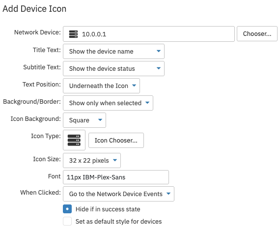 Network Device Icon Settings
You can also use the chooser to add more than one network device at once. A network device icon associated with more than one device will be color-coded according to the device in the most severe state. This option is most useful in cases where you want to display information in your network diagram related to a predefined device group.
Network Device Options
In the network device settings, you can customize the title text, subtitle text, and text position. Next, choose whether or not to include a background/border and an icon background. You can also choose a custom icon if needed. Set the icon size and font to your chosen values.
You can also customize what will open when the icon is clicked. By default, clicking the icon will take you to the associated network device, but you can make it lead to another dashboard, a URL, or nowhere. Finally, choose whether or not the icon will be hidden if the associated network device is in a success state. If you want the styles you've applied to this icon to be used each time you add a new network device, check the box labeled "Set as default style for devices".
Rack Mount Components
A rack mount component is an organization item that mimics the role of a rack in a server room. It serves to group related devices in any way that makes sense to your needs.
You can customize the title, subtitle, size, and style of these components to match your network diagram's needs. Sizes 1U through 6U are available, where the number denotes the size of the unit that will be housed. Stacking different rack mount components lets you organize your network devices as they would be organized in a physical server room. You have the option to control what happens when this element of your network diagram is clicked just like with network diagram elements.
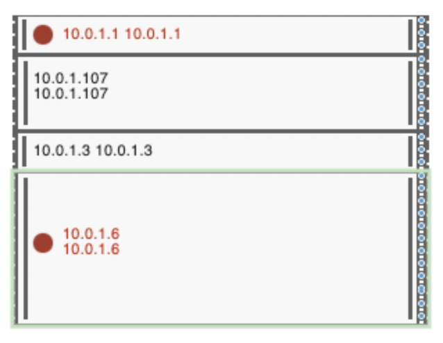 Rack Mount Component
Event Monitor Indicators
An event monitor indicator is an element that shows the status of a network device according to one specific event monitor that it's connected to. Network devices will have a status for each event monitor that's monitoring them, but this element displays the status for only one event monitor to help separate only the relevant value for that device.
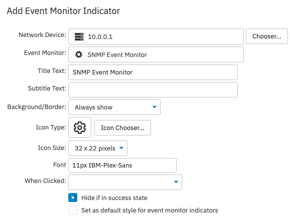 Event Monitor Indicator Settings
You can choose an icon, title, background/border, and subtitle to be associated with the event monitor indicator. Also make sure to choose the size of the icon, the font, and where the icon will lead when clicked. If you want to use these settings in every additional event monitor indicator, check the box that says "Set as default style for devices".
Data Point Indicators
Data point indicators work in much the same way as the event monitor indicator. With the data point indicator, you can view information on an even more granular level. Choose the network device, event monitor, and data point that you want to display. Add title and subtitle text, then choose a background/border and an icon if desired. Configure the rest of the options as above.
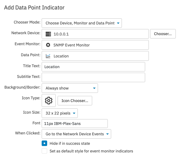 Data Point Indicator Settings
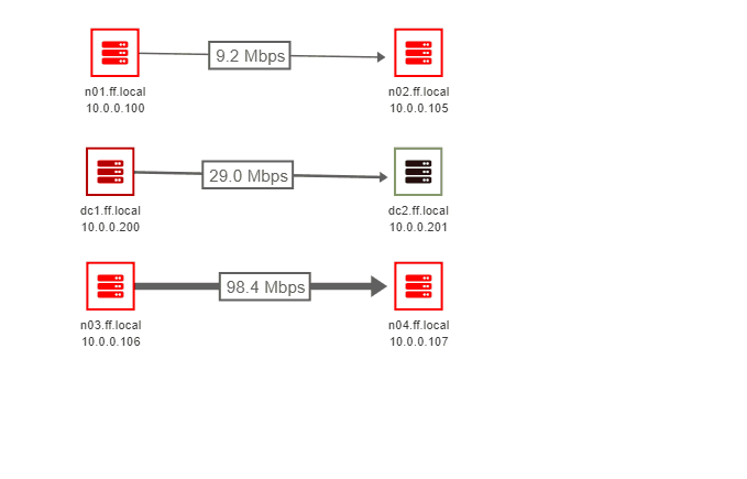
Lines
Lines are the items that connect different icons, providing information and context about how they're connected. Choose between different styles to convey a variety of information about the connections between different elements of your network diagram.
 Static Line Example
Static lines are used to show basic connections between different elements. Once placed, lines have a point at either end that can be attached to any icon. These lines can be used to create an interconnected diagram featuring multiple icons. Use this feature to indicate what's connected to what in a simple, informational manner. You can choose to have straight or curved lines, the latter of which can be edited to curve in any direction. Set the width of your line in pixels, then choose the color and whether or not to include arrows. Adding arrows to the ends of your lines is helpful to indicate the flow of information/connection between different icons.
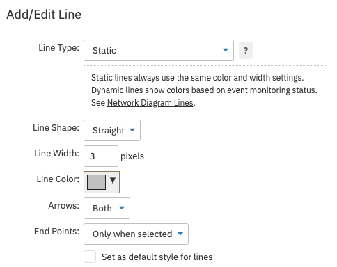 Static Line Settings
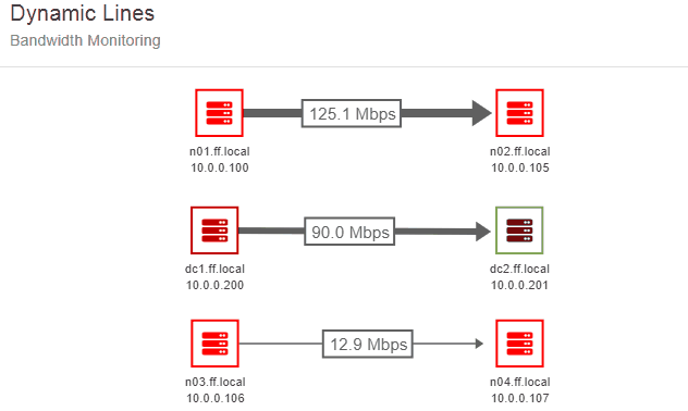
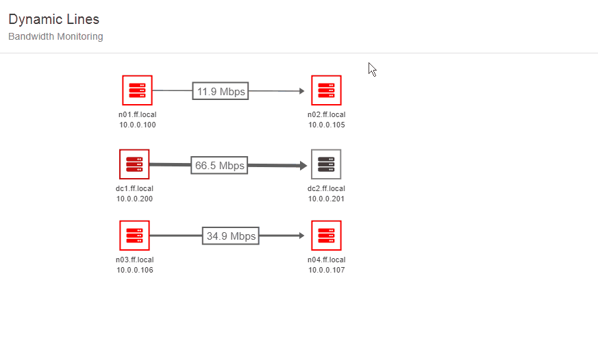
Dynamic lines can be associated with a data point. The color of the line updates with any change to the status of the selected data point. This line option helps indicate the status of a data point shared between two devices. "Dynamic (Red/Orange/Green)" will display data points in a success state in green, while "Dynamic (Red/Orange/Default)" does not change the line color for data points in a success state.
 Manipulating Curved Dynamic Lines
Under "Line width type", you can choose to display either a fixed line width or a variable line width. Fixed lines are always displayed with the same width. Variable lines change width based on monitoring results. If selecting a variable line width type, you have the option to set a minimum and a maximum value for the width of the line. The width of the line will be based on the current value of the chosen data point. Next, enter the maximum expected value for the data point. For example, if the line represents a 1-gigabit link you can use "1G". This value will define the range that will be used to determine the line width. As the value of the chosen data point grows, the line will grow in width up to the maximum value that you entered.
 Line Width Changing Over Time
Shapes and Images
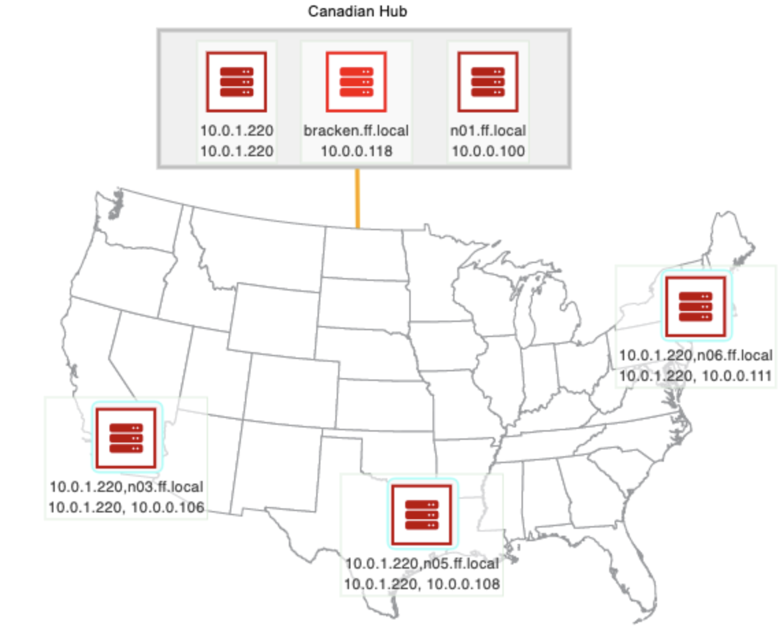
You can also add shapes to your network diagram to denote many different things. Set your shape type, width, height, border, etc. Shapes can be used to add structure and backgrounds to your network diagram to add visual interest or context. Images can be added to further contextualize your network diagram. Some users upload a map image so they can situate their various network device configurations where they're located in real life. This is useful to separate different operations and setups by location and even to show how worldwide operations intersect.
You can choose from a few in-house image options or upload your own. The images you add to your network diagrams are fully scalable, so there's no need to worry about cropping them manually.
 Network Diagram with Shapes, Images, and Text Boxes
Anchor Points
An anchor point serves to connect lines without adding a device or data point in between. They're useful when creating angles between different elements in your configuration that would otherwise be impossible to make with just one line. This item can be used to clean up the appearance of your network diagram. Set the size and color of your anchor point and you're ready to create custom angles.
Text Boxes
Text boxes can also be added to your network diagram. Add a text box to include additional context wherever it's needed. You can control the text, font, and text color and implement these settings each time you create a new text box if needed. Some users find it useful to add a text box to qualify a shape element.
Backgrounds
FrameFlow provides a set of sample images that can be used as backgrounds for your network diagrams. Optionally, you can also upload your own. To create a custom background, enter the URL for the image, what scale you want FrameFlow to use, and any X or Y offsets you want to implement.
 Map Background Example
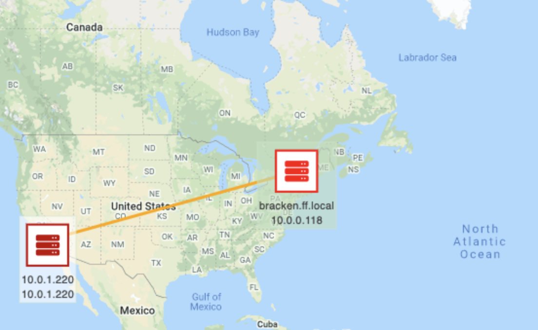
You also have the option use Google Maps to choose a location to serve as the background. This is especially useful when displaying the monitoring configuration of a workplace or campus. You could also display a world map to show overseas operations as well as those at home base. Once you've chosen what map to display, you can configure its opacity and zoom settings, as well as the preferred resolution.
Other Settings and Tips
To move separate elements as a single unit, right-click and drag to create a box over them and drag them to their desired location. They'll maintain their positions relative to each other but move freely across the network diagram as a unit.
 Moving Network Diagram Elements as a Unit
You can also align different elements in relation to one another by selecting more than one icon at a time and then right-clicking. When you have more than two elements selected at once, another option to "Distribute" the elements appears. You can distribute elements vertically or horizontally, which will create a standard amount of space between each element as it aligns them in a row or column. This is useful to tidy up the way your network diagram looks.
 Distributing and Aligning Elements
Finally, you can group elements so that they behave as if they were one element. Grouped elements can then be moved as a unit. FrameFlow provides guidelines that appear when you're trying to align objects manually to make the task easier, as seen below.
 Moving Elements as a Group and Separately
This tutorial taught you what a network diagram is, what they're useful for, and how to create your first one. FrameFlow's network diagrams can be used to convey a vast diversity of information, so get creative! We look forward to seeing what you'll come up with. As always, feel free to get in touch for guidance or to report a bug with this or any other feature.
More IT Monitoring Features