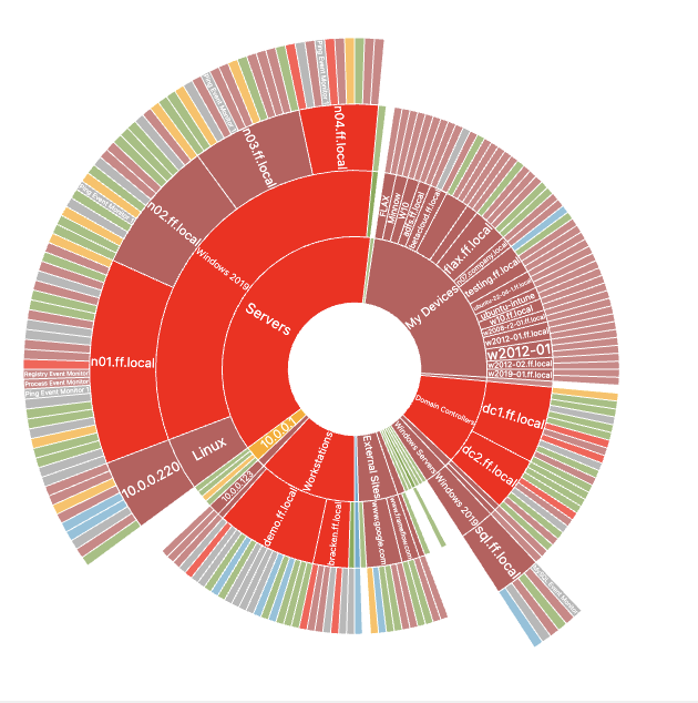
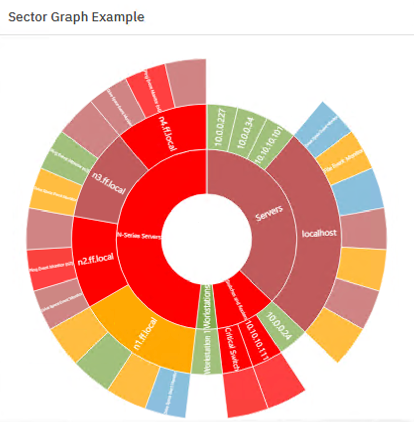
A sector graph is a wheel-shaped graphical display of your monitoring configuration's hierarchy. The center wheel represents network devices in the top level of your organization structure, i.e. the devices in the top folder in the hierarchy. Each subsequent layer represents the rest of the hierarchy of your groups. Each individual segment of the graph is a network device, independently color-coded based on status. An entirely green sector graph represents a monitoring configuration with no active alerts. The nodes at the very outside of the circle are the event monitors that are connected to your network devices.
 Sector Graph Example
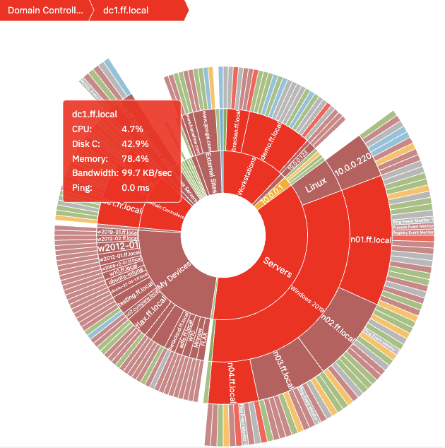
Hovering your mouse over a network device will show system health information, provided that the network device is already associated with a System Health Event Monitor.
 System Health Information
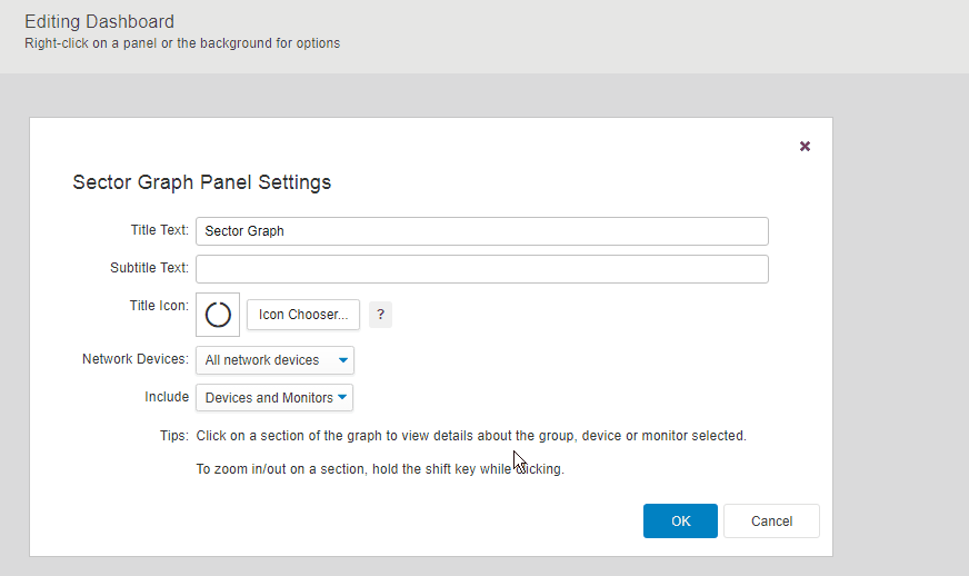
As with many dashboard panels, you can choose a custom title, subtitle, and icon for the Sector Graph Panel. Using the dropdown menu titled "Network Devices:", you can select by group or individually what devices you want to use in your Sector Graph Panel.
The way your sector graph ends up looking has to do with how your existing device groups are structured and organized as well as what folder you choose to be at the top of the hierarchy of your sector graph. Under "Include", you can decide whether or not you want to include the event monitor nodes at the outskirts of your graph. If you don't want them included, choose to include only network devices.
 Sorting by Group
The following settings let you choose the shape and positioning of your sector graph. Use the custom arc option to create half- and quarter- graphs to better suit your dashboards. You can also set a custom rotation and vertical and horizontal offsets to position your sector graph just how you like it within the panel.
 Half Sector Graph
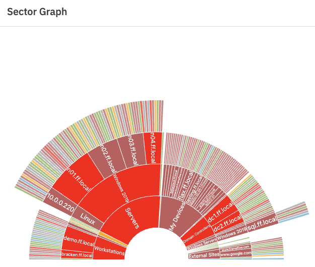
You may choose to have one sector graph of all operations or choose different groups to highlight using multiple sector graphs. Sector graphs that contain one or a few groups will often appear less busy and more focused than a sector graph of every network device and event monitor in your configuration.
 Another Sector Graph Example
This tutorial taught you what a sector graph is and how to use one to stay on top of various monitoring alerts with this visual tool. Check the Features page to see more of your favorite dashboard panels explained in detail!
More IT Monitoring Features