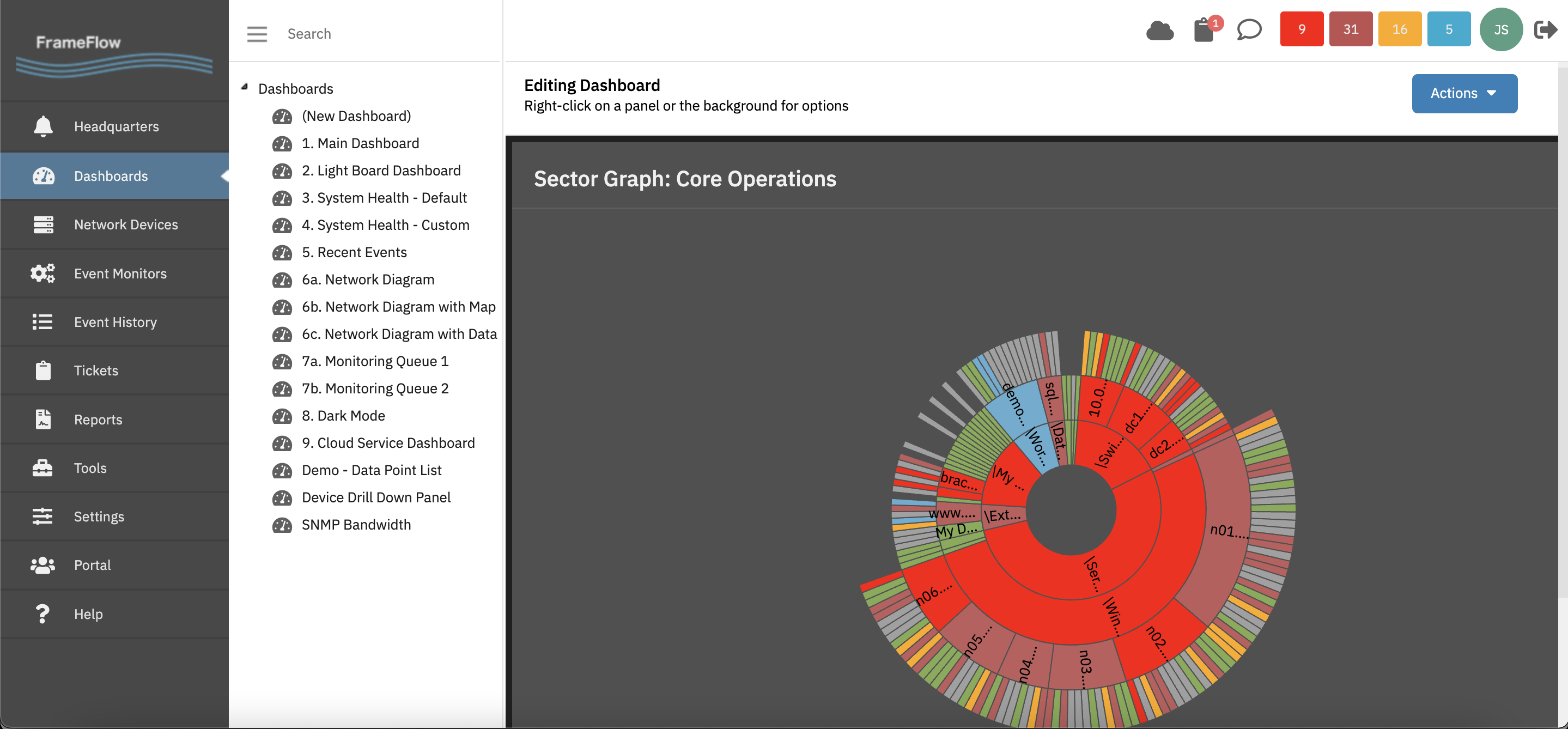
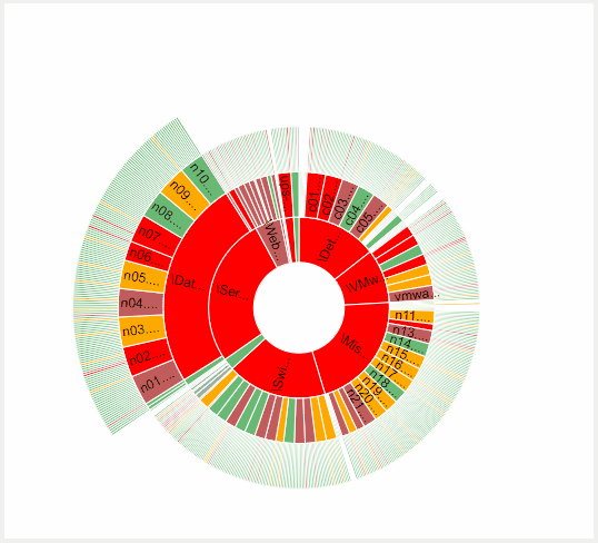
About Sector Graphs
Sector graphs offer a powerful way to see the status of a large number of devices, all in one compact display while preserving information about how those devices are organized.
Organizing Devices
FrameFlow lets you easily organize your network devices in groups so that related devices are logically all together. Many FrameFlow users choose to organize their devices by role. For example, you might have one group for servers, which might contain subgroups for application servers, web servers, and database servers. Others, especially those with distributed operations, choose to organize devices by geographical location. For example, one group for each major region with subgroups for individual office locations.
A major advantage of FrameFlow's sector graphs is that they preserve this hierarchy. The central ring represents your highest level groups. As you move out further from the central ring, you will find your subgroups, then your devices, and finally at the outermost ring you can see each event monitor per device. It's a lot of information all in one compact display.
Dashboard Panel
Sector graphs are a built-in dashboard panel type. Simply create a new dashboard, right-click on its background and select "Add Panel". Sector graph panels are fully customizable. You can choose which devices and event monitors will be included. You can even have multiple sector graphs on a single dashboard with each one focusing on a major segment of your IT operations.
To learn more about sector graphs, check out our tutorial.